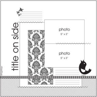
As usual, before I get to this week's sketch I want to share with you some layouts from a few of our readers. A new friend, Sharon Scott submitted her layout this week.
 Sharon used the Bamboo and Bubbles dies along with her Cricut First Arrival cartridge for the title. Thanks for sharing with us Sharon! We hope you join us again!
Our friend, Karin created this layout of her son, Zachary when he was only 4.
 That Zachary is a real cutie! Karin used the Nesting Labels, Fox, Revolution Tree, cookie cutter leaves and a the Revolution Antique Flourish. She also added some of the Quickutz Adhesive Backed Vellum for her journaling. Karin, we're so glad you joined us again this week!
Check out Shar's take on the sketch...
 Shar the large Scallop Border along with a piece of the Scrap-Mart Exclusive Flourish Border. She also used Nesting Ovals and 2x2 Crown. For her title, Shar combined the Metro Skinni mini, retired Fiesta grand font and the G Monogram. I love her hand doodling around the scallops.
Last, but definately not least is our friend Jannie's layout.
 The photo in Jannie's layout is of her dog, Derby. Derby is one of two rescue dogs in Jannie's family. Isn't he sweet?! Jannie used the Revolution Flower, Teriyaki alphabet, Dots Border and a retired Quickutz flower. I like how Jannie is just barely peeking in the photo!
 You gals did a great job with last weeks sketch. Are you ready for this weeks? This week's sketch is from Page Maps and was chosen by our Tammy.
 Since Tammy chose this week's sketch we'll take a look at her interpretation first.
 Tammy used Banana Split for her title along with the Quickutz Scallop Border and Unity Stamps Everyday Use stamp. That beautiful little girl in her photo is her daughter, Catherine.
Here's Jenn's layout...
 Jenn used the new Teriyaki alphabet for her title and the Quickutz Club Circle Journal tag. Looks like her hubby celebrated Father's Day while working!
Veronica used the new Central Park alpha for the title on her layout.
 She also used the small Scallop Border and a stamp from Unity's This is the Time large stamp set. Veronica added the butterfly and added some glitter to it. Don't you LOVE those photos?!
 I created this layout per my husband's request.
 For as long as I can remember I've called my husband "Babe". Not long ago our daughter called him "Bib" and when he asked her what a "Bib" was she said "you know, like a baby." She still calls him that! I used my Slice and the Fonts Essentials design card for the title, Basic Shapes 1 (that came with my machine) for the hearts and the Just Chillin' Teen design card for the girl and boy silhouettes. The heart on the right side of the photos is actually a pull tab for my hidden journaling. My husband is happy with the layout and has started a list for others he'd like me to make!
We're so glad you joined us today. We'll be back Monday with some more great projects and pics of the booth from the Tulsa convention. Oh, and we also have a booth set up at the Chicago convention so if you're attending that one, but sure to stop by and say hi to the guys there! Have a great weekend and we'll see you Monday!
Katie


1 comment:
Wow ladies - great projects today!! Love to see everyone's take on the same sketch - you are all so creative!
Post a Comment