Before we get to the sketches I wanted to show you another great project from PJ.
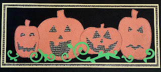 PJ made this border by layering pumpkins she cut with the Spellbound Slice Design Card. This would be easy to make with the Spellbinders Pumpkins too! Wouldn't this look great along the bottom of a Halloween layout?
Now, to refresh everyone's memory let's take a look at last week's sketch.
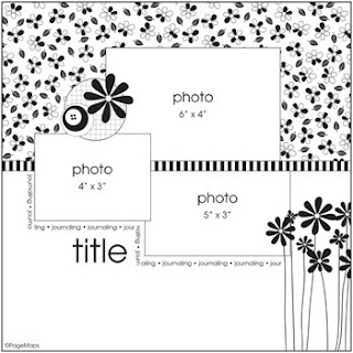 I found this sketch on Page Maps.
 Our friend Karin let this sketch inspire her to create this cute and spooky layout...
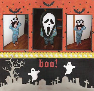 Karin used the Graveyard border along the bottom of her layout and added some 2x2 Bats and Ghosts and the tree from the Haunted House with Tree cookie cutter die set. She used the spooktacular Haunted alphabet for her title. I love how the middle photo makes the mask look so much larger than his little body!
 Jannie also took on the sketch last week. Check out her layout...
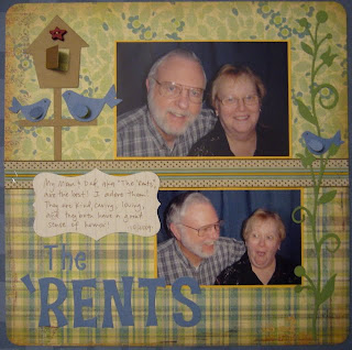 Jannie opted to add a journal block in place of one of the photo spots. She mixed the Strawberry and Teriyaki fonts for her title. She also added the Revolution and 2x2 Bird, Vine border and and Nesting Labels. This is one die-packed layout!
Shar's layout is one subject I dread when I think of my daughter!!!
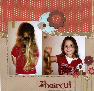 Just look at that ponytail! Shar used the Paperdoll and Studio Skinnimini fonts for her title. She added the Nesting Circles, 3-d Flowers, Cookie Cutter Flower Shapes, Scissors from the Cookie Cutter School shapes and the Revolution Sunflowers. Gracie's just as cute with shorter hair, I think!
Okay, so are you ready for this week's sketch?
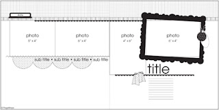 This is another great Page Maps sketch.
I really liked this sketch and decided to make my layout as close as I could get to it.
 I topped my pictures off with the Bead Border and framed one of the photos with the Spellbinders Polka Dot Frame. I mixed Moonlight and Flirt fonts to create my title. The little hearts also came from the Flirt gift set and I added one of the Revolution Birds. The cardstock used for the frame, birds and hearts is Core'dinations and after cutting it I lightly sanded it. I really haven't been much into two-page layouts but I do really like how this one turned out!
Well, we hope you've found some inspiration here today. When working with a sketch, even if your layout doesn't look exactly like the sketch, or anything like the sketch, that's totally okay! The sketch is simply a starting point for inspiration. It could be the number or arrangement of photos, the colors in the sample or the actual shapes used in the sketch that inspires you. If you'd like to share your projects based on any of our sketches, even past ones, you can email them to me at katie@scrap-mart.com. Enjoy your weekend and have a safe and Happy Halloween!
Katie


No comments:
Post a Comment