Since we our numbers are growing and I realize it is very possible someone may be viewing this blog for the very first time, I'm going to start by showing last week's sketch again.
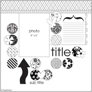 And now, let's take a look at what our readers did with this sketch. First up is first-timer Marie Ashcroft. Marie took the sketch one step further and made a double-page layout!
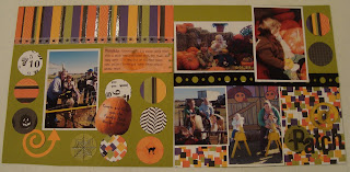 She used some Nesabilities to make her circles and added the Quickutz Revolution Arrows.
 Now, let's take a look at Shar's take on the sketch.
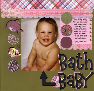
Shar used the Yogurt Grand alphabet for her title. If you look closely you can see she cut it in two different colors and layered them for added detail. She also used the Relax Gift Set (dolphin and fish) and Cookie Cutter Baby Shapes (duck).
Our friend Karin joined in this week too!
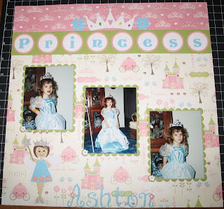
She used the Sophie and Storybook fonts and the Flower Border (center) for her title. Karin also used the Revolution Crown and Rectangle and Scallop Rectangle Nestabilities.
Our friend Jannie also took the sketch challenge this week. Check out her layout...
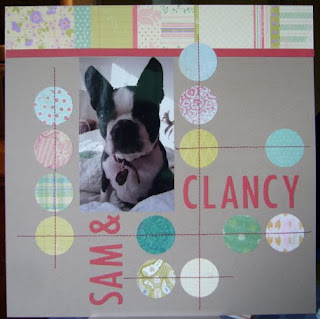 Isn't that a cute dog?! While Jannie happened to use a circle punch for this layout, she pointed out that it would've been just as easy to use her circle Nestabilities or even the Quickutz Nesting Circles. Jannie used the Studio Skinni Mini font for her title.
All I can say is WOW!!! We are growing every week and you are all doing a fabulous job with these sketches! I'm so glad you're finding inspiration in them. Thank you all for sharing your layouts and joining in with us every week!
How 'bout a new sketch? Are you ready? Okay, here you go...
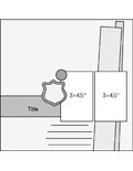 I found this one on Scrapbook's Etc. Whatcha think?
Here's Tammy's interpretation of this week's sketch...
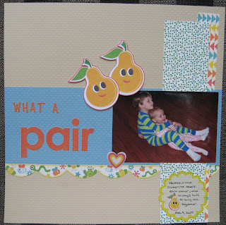 Tammy used the Sassafras Lass Me Likey papers and cardstock stickers for her papers and embellishments and the Summer of Fun Chicken Noodle alphabet for part of her title. She cut the pears from a piece of the patterned paper and used pop dots to give them added dimension. Very cute!
Veronica used photos in place of the paper strips for her layout.
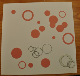
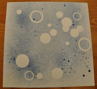
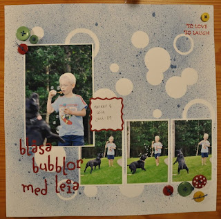 Veronica used her Quickutz Nesting Circles to cut the masks she used to make her background.
  And here's what it looks like after she misted it...
 Veronica used the Miss Muffet alphabet for her title, the Quickutz Square Nesting Label and one stamp from Unity's This is the Time stamp set. Don't you just love the custom look of this layout?!
And here's my take on this week's sketch...
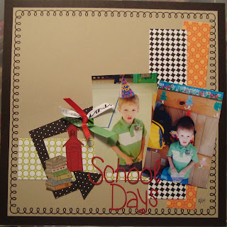 The papers I used are from Scenic Route's Garden Grove collection. For the title, I used the BossKut Boy Scout alphabet (LOVE IT!). The stamped books are from Unity's Hodge Podge of Happiness kit and the school house was a stamp in one on Unity's KOTM. I really love the colors in the Garden Grove collection.
Thanks to you all for stoppin' by today! We'll be back on Monday to share some more inspiration! I hope you all have a great weekend!
Before we close I'd like to ask you all to take a moment to think about 9/11 and the families who were affected on this tragic day in 2001. My thoughts and prayers go out to everyone affected and especially those who lost loved ones. Thank you to our troops and their families for their sacrifice as they continue to fight for our safety and freedom.
Katie


2 comments:
Lovin' all the reader layouts this week!! Lots of clever takes on the sketch. I love how Marie tied together the patterned paper on both pages with the circles.
Shar - I never would have thought of cutting the relax shapes in patterned paper and they look fabulous on your page. And Karin I love your use of the flower border - it may be one of of my all time favorite dies - I need to get that out and use it more!
Finally - Katie - I didn't think the Boy Scout font was one that I 'needed' but now I think I just might be enabled....
Katie what a great idea including the previous week's sketch along with the pages of those who participate. Sometimes I forget what the original sketch looked like and it would be fun to have it included for comparison each week.
Everyone did such nice things with it! I love all the different interpretations! Kudos, everyone!
Post a Comment